Monday, February 24, 2014

Weeks 6 & 7 - Getting ready for the concrete

Week 6 brought more snow

Cold temperatures and endless snow made it impossible to get any work done in week 6. It’s hard to believe how wintery this winter has been, especially since the fall was so warm. Now the project is buried deep in snow, seemingly halted indefinitely.

Week 7 - a tent for the concrete

Wow! The builders saw an opening in the weather and scrambled to put up a tent. Check out the major snow removal operation they pulled off. We must have had an accumulation of at least two feet of dense wet snow, yet they somehow shoveled all that snow off of the EPS foam and also plowed extensively around the perimeter.

The purpose of the tent is to keep the concrete warm enough so that it can solidify and be polished, and to protect it from the elements. The polishing process is done under water (to protect the crew from harmful dust particles), so the temperature must be kept well above freezing. You can see a large propane tank off to the right. We’re probably using more energy to keep that tent warm than will be used by the home for many years. Hopefully, everything will go smoothly with the concrete and it will be done soon.

Here’s what it looks like inside the tent. The structural fill has just been compacted, burying the plumbing, conduits and radon mitigation piping. Now, rebar must be installed prior to pouring the concrete, which should happen tomorrow.

Sunday, February 9, 2014

Floor plans 1

image-315

Many thanks to GO Logic

I expended a tremendous amount of energy fussing with the floor plans of this home, much to the terror of my wonderful team of architects at GO Logic (Matt OMalia, Todd Boyd, and Svea Tullberg). Even though GO Logic provides off the shelf plans, I felt the need to demand certain changes to their plans, then promptly reversed those changes, only to eventually reinstate the original changes. In the end, we must have gone through at least six iterations of the floor plans. I owe many thanks to Matt, Todd and Svea for their amazing patience, professionalism and talent.

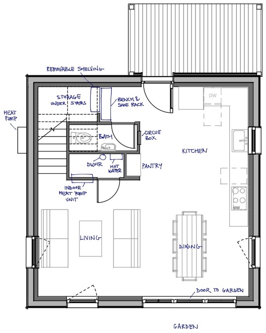
I learned a lot through the process and I thought I would share why I settled on the floor plan pictured above, which I believe is going to be terrific. Im including only the first floor in this post, the second floor is just as cool, but it will come later.

How to make a tiny home feel gigantic

I’m not an architect, but over the years I’ve noticed a few tricks that seem to make a small boxy space feel bigger than it really is. A few years ago, I attempted to use these principles in the layout of my lab at Mount Holyoke College, a small 600 sq ft research space for next generation solar cells — and the results were fantastic.

  1. Open up the floor plan as much as possible
  2. Make sure that the line of sight from any location extends as far as possible, preferably the full length of the house
  3. Use long straight lines or spaces wherever possible to simplify visual clutter and emphasize elongated forms
  4. Substitute sliding or double doors where possible, to be able to open up or close off the floor plan as needed
  5. Use well placed widows to illuminate all areas and open up smaller areas

Below, I’ll explain how I went about implemented these design rules.

Using 3D renderings to plan the layout

To get a feel for the floor plan, I generated 3D renderings of the interior using the mac app "Live Interior 3D Standard Edition." The app lets you draw a floor plan and then creates a 3D space that you can navigate through. I didn’t like the tacky color and faux realism of the renderings, so I used my iPad to trace some of the critical scenes as line drawings. The simple black and white lines might be a little difficult to look at at first, but they allow your mind to fill in the extraneous details.

The dininitchen room

image-314

The entrance leads directly into a single open space that serves as both the kitchen and dining space (above) — hence the dininitchen — a large area for gathering, cooking and eating. Three large windows behind the dinner table open up the space even further. The kitchen counter spans the left wall, with the induction cooktop and range hood almost spilling into the dinning area, blurring the distinction between the two rooms. A small built-in counter and shelving area to the right will serve as a pantry.

image-313

Off to the right of the entryway is the mud room and a half bath. A small bench to remove your shoes sits in front of a removable bookshelf, giving access to hidden storage under the stairs. An opening in the upper wall looks through to the staircase landing, helping to bring in light from the large window in the stairway. I wanted the bathroom to be tucked away from the kitchen and the living room, and to be easily accessible from the outside.

image-312

Looking from the dining room back at the entryway (above), notice how the kitchen counter follows an L shape along the wall — the layout allows for ample counter space while giving easy access to the front door, half bath (to the left of the door), the pantry, the dining area and the living area. The straight line of the countertop along the right wall lengthens the kitchen area, creating a sense of an usually large kitchen.

The closet off of the living area doubles as a storage space and utility room for two of the on-demand hot water heaters, the heat pump wall unit and the drain water heat recovery (DWHR) pipe.

An efficient dinner assembly line

image-311

The kitchen is laid out to maximize the efficiency of manufacturing dinner. The cooking process moves from left to right, starting with the vegetables in the fridge, moving to the counter, washing in the sink, cutting on the next counter, frying on the cooktop, and then serving at the dining table. Cleanup follows the same linear pathway in reverse: dirty dishes move from right to left; from the dining table, to the counter, to the sink, and into the dishwasher.

Handling sunlight throughout the day

image-310

One aspect that I love about this design is how sunlight moves throughout the space over the course of the day. The image above is looking at the living area from the kitchen.

The morning sun from the east filters into the kitchen window through the row of trees on the east property side. Breakfast at the table is warmed by the morning sun as well. Later in the day, the sun might be too strong at the dinner table — a tremendous amount of energy is captured by the three large south facing windows — but the living room offers a refuge with some protection from the sun. Afternoon sun keeps the living area illuminated continuously as the sun moves from the south facing window to the west facing window later in the day. In the afternoon, the kitchen will be free of sun, so cooking in the heat of the sun is not a problem.

Stay tuned to find out if the design actually works in practice!

Saturday, February 8, 2014

Week 5 - Snow

We have no progress to report this week, again due to the snow and the cold temperatures. I thought I’d post a picture of the lot covered under a foot of snow. Looking at the forecast, temperatures are set to stay cold for at least a month — keeping us stalled for a while. Kyle (the builder) is apparently hatching a plan to install a tent and some sort of heating system in order to create the right environment to pour the concrete and finish the surface properly. It sounds like an ambitious plan. I’m eagerly waiting to see how it turns out.

Wednesday, February 5, 2014

Why are passive houses so cute and boxy?

OK, now it’s snowing like crazy. Looks like there won’t be any progress on the construction for a while. In the meantime, I thought I would begin to explain some of the special traits of the Potwine Passive House in more detail. In the next post, I’ll show the floor plans, but first we should talk about why the home is shaped the way it is.

Passive houses tend to be cute and boxy

I love the look of passive houses. Pictured above are Little Compton (Zero Energy Design); Lancaster High Efficiency (Garland Mill Timberframes); Urban Green (Sala Architects); and R-House (ARO and Della Valle Bernheimer), clockwise starting from the upper left.

Less surface area saves energy

You might have noticed a common theme — these houses take the form of a box, more or less. Here’s why: it’s an attempt to achieve a low surface area to volume ratio. Imagine a square box versus a long rectangle, but make sure that both are sized such that they each enclose the same amount of volume, as shown in the drawing below:


In this example, both the cube and the rectangle have the same volume, but their surface area is different. It turns out that the cube will always have less surface area than the long rectangle, regardless of whatever volume we choose. Similarly, a box will have less surface area than a series of partially detached smaller boxes, which might remind you of most house designs.

The problem is that heat energy is lost through the surface area (the walls, roof and windows), so more surface area will allow the same volume of space to cool down faster. Passive houses often employ boxy designs because they yield better thermal performance.


I’m sure that many would find the typical boxy passive house to be extremely limiting, but that’s where the brilliance of architect Matt O’Malia’s GO Home is apparent (pictured above): he’s made a boxy and plain structure seem open, interesting and bigger than it really is.

Choosing the exterior form factor and the square footage


One of the project’s first steps was to choose among the preset house designs and floor plans available on GO Logic’s website, which offers single story 1000 sq ft plans up to double story 2500 sq ft plans. I initially came to the project thinking that I would want to live in a bonafide tiny house — a romantic dot on the landscape surrounded by expansive open space — but the thought of raising a family in a tiny house eventually scared me off. I gravitated toward a three bedroom design, partly due to the recommendation of my real estate agent, Mike Seward: three bedroom homes tend to be easier to sell. A second story appealed to me because I felt that views of the surrounding landscape and wildlife would be enhanced by the extra height, and more space around the home would be available for a vegetable garden.

After discussing my budget with Matt O’Malia, it was clear that the 1300 sq ft model was the most I could afford. Although I didn’t know it at the time, the actual usable square footage is even smaller: 1100 sq ft, about half the size of the average home in the US. At this point, most people would balk at the idea of a passive house: they could have a standard 2200 sq ft house for the same upfront cost! Don’t get me wrong: I’m not saying that a passive house is more expensive. The upfront costs are higher, but the monthly costs are lower (almost zero) — one of many ways in which greener products are unfairly financially disincentivised.

The next step was to figure out how to make the most of that 1100 sq ft.

Sunday, February 2, 2014

Week 4 - No progress, still too cold

Unfortunately, no progress was made again this week — the weather was just too cold. Kyle (the builder) gave me an update about the SIPs wall panels (see my overview post for a brief introduction to SIPs), explaining that the panels are now in production and should be ready in a few weeks. There’s a lot to do between now and then: pour the concrete and put up the frame so the panels can be hung into place when they arrive.

We have to be careful about pouring the concrete in the cold because the concrete slab will serve as the finished floor, and the texture of the surface of the concrete could be comprised by the cold. The good news is that the weather seems to be warming up. Let’s hope that it stays warm and doesn’t snow!